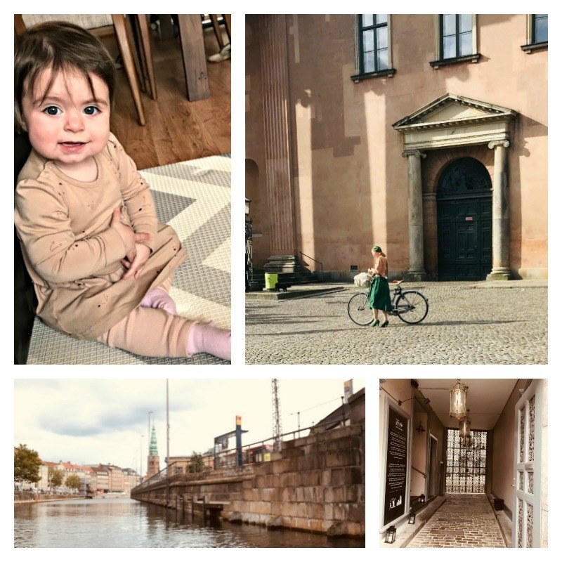
Hygge- a Scandinavian word for cozy has a broad meaning of anything nice. Hyggerly is often used to express the feeling of coziness.
I was lucky to actually inhale the magical Nordic fall colors during my recent trip to Denmark, Sweden, and Finland. Because the sun is not so strong there in the fall the softness of the shadows is everywhere making the buildings look fairytale-ish. Brownish rose, dusty blush, and green-gray are on the walls of the nurseries as well as posh living rooms. They are the color for fabric, millwork, kitchen cabinets and even babies’ silicon bibs. As you can see I crushed on it. And since my house badly needs a color change I decided to explore a brown-pink modern paint color.
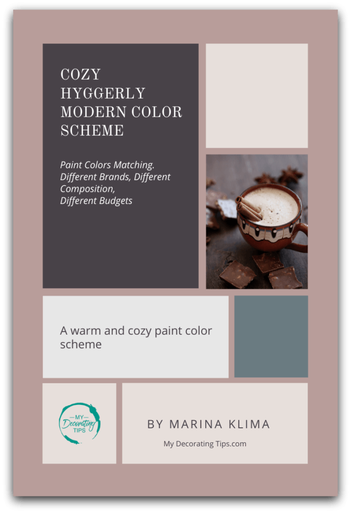
Here is the Cheat Sheet for you below with a complete Color Scheme. Just click on the image below to get it into your inbox.
I thought the winner was Farrow and Ball Sulking Room Pink.

Sulking Room Pink
This dusty, brown-pink works great with many colors, but I love how it looks against dark brown-black.

Paean Black. Dark wood cabinets paint color.
Because I know that paint colors are tricky and look different depending on the room and lighting I first collected the whole bunch of photos.
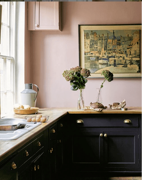
I think this black paint color with red undertones looks great here since as it picks from the wall color and makes it looks even richer. Because this kitchen has large windows and plenty of light the walls look lighter.
Paint colors look different in different rooms. So Confusing!
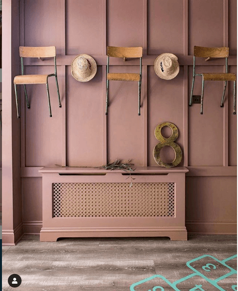
A pretty playroom with paneled walls painted in Sulking Room Pink is fun. But it looks much darker and more saturated than in the first picture.
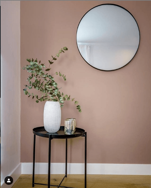
And in the photo above Sulking Room Pink looks more like a peachy brown.
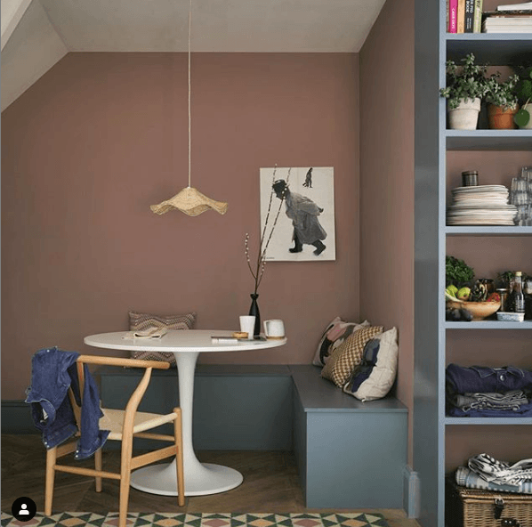
This kitchen nook obviously doesn’t have enough of the natural light so the wall color is also more peachy- brown. I like how it works with wood paint color (Farrow & Ball De Nimes).

Now I am confused. How will I figure out this paint color?
So I got a sample of the paint for $8 (but it is real paint in the finish I wanted). The quantity is enough to go on a painting frenzy. I always recommend to try it by the door, next to your furniture, by the baseboard, by the windows. Look at it in a different light- at night and during the day; with curtains open and closed. Only then you’ll know if you like it.
Can Farrow & Ball be matched to other brands to cut the cost?
Another thing is Farrow & Ball paint is expensive (a whopping $110 per gallon) and there is no store in my area! This means that I’d have to travel twenty miles to the nearest store or order it online. Now what?
I Googled again and discovered that one of my favorite bloggers, Lauren Bern created a color matching chart where she shows Farrow & Ball matches to Benjamin Moore. According to Lauren Sulking Room Pink by Farrow a& Ball will match Benjamin Moore 2105-40, Dusty Ranch Brown.
Sulking Room Pink vs. Dusty Ranch Brown:

Pretty close, right?
Yes and no.
It depends on the lighting in your room.
Here is the room photo with Benjamin Moore Dusty Ranch Brown paint color:
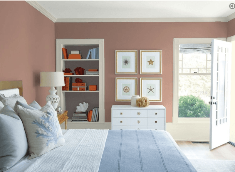
But knowing that it can all look different in a different light I found another close match.
Treat paint color matching with caution!
Here is why:
Farrow & Ball Sulking Room Pink vs. Barberry by Benjamin Moore :

What is the difference in quality between Farrow & Ball paint colors and other brands?
It’s true that today people know the science of paint color matching from one brand to another.
Does it mean that any Sherwin Williams or Benjamin Moore paint store will match the paint that you want and save you some bucks?
Not exactly.
Trying to have a complete twin in terms of paint color is like buying a dress for $49.99 online that looks identical to the one that costs five times as much. Teeny problem. When it arrives you see that the fabric quality is very different. It’s poly and not silk, it’s made differently altogether. But I don’t care. I keep the dress anyway because overall it looks really good for the price. The same with paint colors. Because the brands guard their exact chemical formulations as a top-secret it is very hard to get the same look and feel.
You can find a good-enough, somewhat similar paint colors match when you switch from one brand to another.
Yes, certain colors, such as neutrals and some whites will look close in color. However, when it comes to rich, deep, modern paint colors the difference is more obvious. Only you can decide if whatever you choose is good enough for you.
Paint color scheme is my next adventure
Now I am on a quest to try this color scheme. Are you with me? After all who wants to paint a house and then get tired of the colors a year? To avoid this click here to get the shortcut Cheat Sheet.
Tell me what are your challenges when you try to find perfect modern paint colors?



Leave a Reply