Apparently, best Benjamin Moore white paint color will look beautiful in one room and dingy in another. Besides, even in the same room, the white paint that you loved in the morning looks like nothing at night.
Here are a few questions before you buy ideal white paint:
- Is your style modern, traditional, boho or eclectic?
- What mood do you want to create? Is it a romantic retreat or a busy family room with young children?
- What kind of lighting are you planning to have in this room? For example, are you just using high heads and no accent lights?
Tip:
Since lighting is important for your room, make sure you plan for it before you choose the paint.
Boho Style
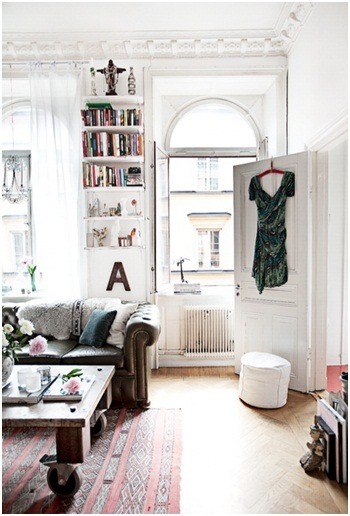
Because a room in a bohemian style usually has many pieces of furniture of different periods, go for Benjamin Moore White Dove OC-17. This paint color has a touch of cream in it so it won’t be stark white but yet crisp and pretty.
Romantic Retreat
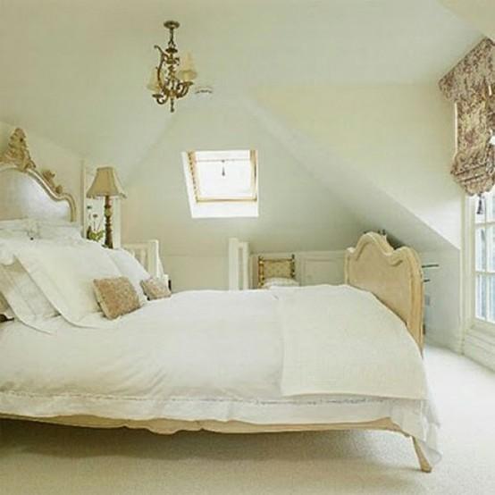
On the other hand, soft whites and off-whites will add softness to a romantic hideaway bedroom. Choose the bedding and accessories within creamy tones and avoid stark white. In the case of a small room, paint walls and ceiling the same white. Surely, the ceiling will look a shade darker when you choose the same white paint. If this bothers you, pick a slightly lighter white.
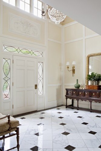
Define the Ceiling and the Moldings for a Classic Style
Select crisp white paint for moldings and doors that is lighter than the walls. For example, use Benjamin Moore Ivory White 925 for the walls, and White Dove OC-17 for the moldings.
Create Contemporary Luxe With White
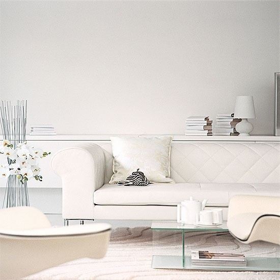
True to form and its name, Simply White 2143-70 is perfect for a modern simple but glamorous room. Mix different textures and forms within similar white tones for a contemporary glamour look. Finally, add textures within accents to elevate the room to a luxurious and comfortable oasis.
White Paint for the Intersection of Elements
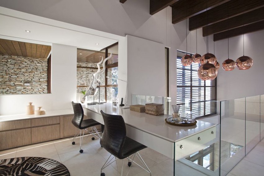
Select Cloud White OC-130 for the walls to emphasize the room’s architecture as well as successful design. Don’t be afraid to use different elements, such as natural elements juxtaposed by glossy reflective surfaces. Finally, use black for visual focus.
Have fun painting and don’t forget to share with us in your comments! Please post your questions here below. I’ll be happy to help you!
When the term “ double down “ is used regarding paint colors such as an ivory white color, will you explain what that means? Thank you.
Hi Sharon,
Thank you for your comment. May I ask where you heard this expression? What was the context?
You didn’t mention Benj Moore’s “Brilliant White” and I’m wondering about it. I hired a color consultant to suggest the colors to paint my big box of a rather traditional house. Since I like taupes, she chose BM “Valley Forge Tan” and paired it with the trim in “Brilliant White.” I expected something purer white. Do you think the “Brilliant White” will accent the “Valley Forge Tan,” please?
What style is your house? Modern, traditional, transitional? I mean furniture? What are the colors of the floor and the cabinets?
Oh, sorry I was so incomplete…It is for the exterior of the two story traditional home—Valley Forge Tan she chose for the stucco, Hardie plank siding and Brilliant White for eaves and underside of porch. I read that Brilliant White from BM has a cool blue cast to it so was surprised it is being paired w the Valley Forge Tan.
Also, my painter wants it color matched to the Dunne Edwards Paint he prefers using…Am I going to run into any problems w the color matching if I take a quart of the BM paint with me to the Dunne Edwards Store to color match?
Phew…this is hard work Im unprepared for. Thank you for your insights!
I actually did some research and looked at houses with Valley Forge Tan exterior paint color. It is pretty and trendy. Now. Brilliant White is too sharp of a contrast with it. Yes, it has a soft blue undertone, which is okay but it is too bright for Valley Forge Tan. If you want high contrast – use true whites, such as Chantilly Lace or High Reflective White. If you want a softer look use Pure White, Simply White, Cloud white or White Dove. I recommend comparing a paint strips- all of them to Chantilly Lace or High Reflective white. Put them side by side, one at a time. I tend to like a more subtle transition if colors. Scandinavian is a huge influencer and the trend that is staying with us for a long while and I predict that high contrasts are going to fade away.
I just love white! So simple and yet so classy. Clean strategy! It is like a fresh start to a home’s interior by painting it white
Love the lamps and the vanity units, especially the Genoa 1500 vanity
unit. Great pics, giving me food for thought for my outdated bathroom.
Thanks for sharing.
I love the romantic look and the white you chose is beautiful. I am going to the paint store today to buy a sample. My home is tiny and I want it to feel cozy, and romantic . The BM Ivory White looks perfect for the job. Thank you for all the tips along with pictures for what white can do to a room.
With gray being all the rage – it is still nice to know white has not gone out of style.
Great job! I always go for colorful designs and preferred to stray away from monochromes, since I find them too clean, too boring, but this post is making me think differently. Keep those post coming!
I am glad you got some new ideas, Marie
I’ve always been one to avoid white as a room color because I’ve always felt it has the potential to make a room seem “too clean”. This article may have changed my mind though, bravo! My personal favorites were the architectural and nostalgic themes.
I’ve always been one to avoid white as a room color but this article may have changed my mind. My personal favorites were the architectural and nostalgic themes.
I have never seen white this way. I particularly love the “Crisp and Clear Backdrop” design.
Gwenn, thank you for reading this post.
I love the beautiful & simpleness that you have shown here!! Thank you for your super useful tips & info on this subject!!
I really love white interiors; white walls and furniture are symbols of wealth, sophistication and aristocratic way of life. The uniqueness of white color is that it allows you to create interiors in almost any style – from minimalist to pompous. White interior can be cool, glamorous, elegant, refined, luxurious, and festive. These are useful tips shared to make your home cozy and warm using white color. Thank you.
Simplicity is always best and in white room you can make good decoration with any color of home accessories.
Well, I have to admit that initially my impression of white is very limited. However, I’ve had first-hand experience with the adventure of selecting white hues for my house when I decided to put my house on sale, I decided to repaint the entire house and the choice of color became a big challenge. With so much on my mind, I eventually turn my attention to white. At first my thinking is, white is white…right? I never realized that there are still, variations and different hues of white.
After the re-painting task was completed, I walked into the house and I fell in love with it. I was amazed at how beautiful the walls looked. Then, I told myself white really create impact in so many different ways. That’s when I truly realized that white can be as strong as any other color. This information is really amazing!!! Very True, Indeed!!!
thank you, Russel. I am glad you found this post helpful.
I’ve always loved the idea of having white rooms. It’s simple, it’s classic and it never goes out of style. But I completely agree with you, decorating your white room can be quite tricky. I loved the ideas you shared. I loved the feel of the different white room atmospheres. I’m actually thinking of using one of the ideas to recreate the look of my home. Thanks for these simple but amazingly beautiful tips!
Thank you, John
I now believe that in simplicity there is beauty. Last night my husband and I were discussing repainting our room. We were debating what paint color to use. He wants it to be plain and serene, while my type, on the other hand is something creative and alive. It never crossed my mind about the possibilities of merging two ideas. This is very informative and exciting. We can take one of the many options here.
Thank you, Phenny, I am glad it was helpful.
Wow — who knew white could be so interesting? Thanks for the fresh thinking and great examples!
Thank you, Celeste for your comment and finding the post interesting.
I learned so much from this article Marina. Please keep up the Great Work! I am looking forward to your next blog!
Thank you, Pete. I am glad you learned something useful from the post. Thank you for kind words.
Great tips Marina – thanks!
Wow, beautifully done darlin’. I’ve always leaned toward the intense colors, so seeing how much you can do with white is a revelation.
Thanks for sharing!
may your day be igKnighted with passionately powerful possibilities!
MamaRed
Thank you, MamaRed. You made my day!
Nice timing!! I am using whites for my office in our new home. These are very useful tips!!
Oh, yes Congratulations, Andrea. Let me know if you have more questions. Really.
Nice blog Marina. I had no idea there were so many variations of “White”. The ideas here are very clear and the photos wonderful! Great job!
Thank you, Ben! I am glad you find this post helpful. It comes from many observations and research, both in my practice and learning from others.